Modernising Sentinel without breaking analyst trust
Sentinel is a Data Security Posture Management platform that shows security teams where sensitive data lives, who can reach it, and what's going wrong. A decade of shipped features had left it functionally trusted but dense and inconsistent, slowing the investigations it exists to speed up. I led the redesign, modernising it end to end while protecting the muscle memory of analysts who use it 6–8 hours a day.
Role
Senior Product Designer
Timeline
11 months Feb 2025 – Dec 2025
Team
1 PM · 4 engineers · 1 squad · 1 content designer
Responsibilities
Design direction · Systems architecture · Analyst research · Engineering handoff
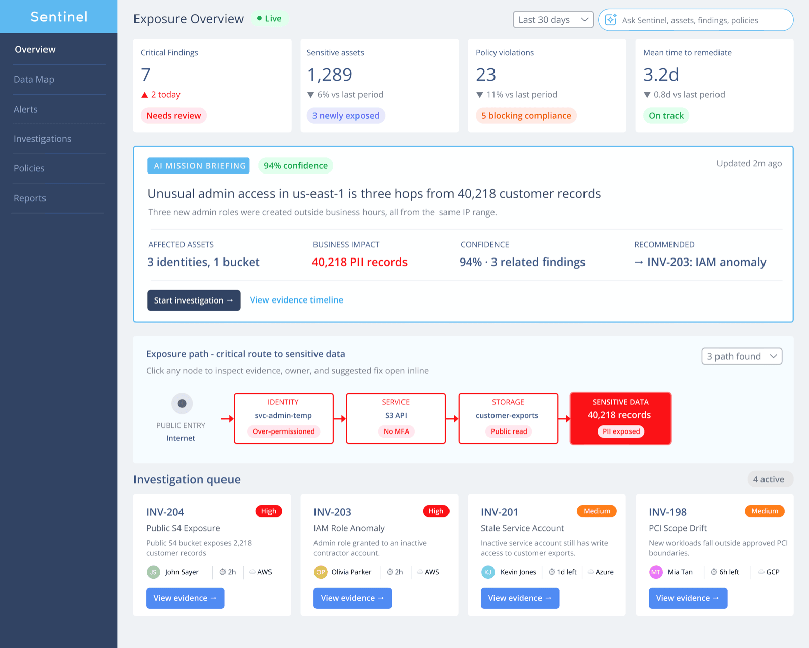
Sentinel's redesigned Exposure Overview — an operational command centre that answers what needs attention, what's at risk, and what to do next, in that order.
The problem was never that Sentinel lacked capability. It was that finding the one finding that mattered took longer than fixing it once you found it.
34%
faster median time-to-triage on critical findings
5 → 2
clicks from alert to evidence timeline
260 → 34
one-off UI variants consolidated into a governed library
Fourteen analyst interviews, a year of support tickets, and three workshops all pointed at the same root cause: the tool wasn't wrong, it was illegible under time pressure.
14 of 14
analysts re-verified a finding by hand before acting on it
6 of 14
kept a personal spreadsheet because they'd stopped trusting the dashboard
38%
of support tickets were "where do I find X," not a defect
80%
of searches reused the same 5 filters, none of which could be saved
Those four findings became four rules — not values on a slide, the test every design review came back to.
01
Surface risk immediately
The highest-risk item should be legible before a single label is read.
In practice — findings sort by severity by default; critical items get colour, weight, and position, never just a text tag.
Every screen answers one question well, not five questions poorly.
In practice — the Overview shows 4 numbers, not 40; deeper data sits one click away, not zero.
02
Reduce cognitive load
03
Support investigation workflows
Design the path from alert to resolution, not just the screens along it.
In practice — evidence, related users, and policy context live in one investigation view, not four tools.
A pattern used once is a decision. Used forty times, it's a system.
In practice — every severity indicator, card, and status chip draws from one governed component set.
04
Build reusable patterns
02 — Decisions We Got Wrong
The navigation you saw wasn't our first idea
Principle 01 says surface risk immediately — so our first read of it regrouped nine flat legacy destinations by severity level, literally. It tested badly, and taught us the difference between an attribute and a structure.
Attempt 1 — nav organised by severity
Sentinel
Critical
High
Medium
What shipped — nav by task, severity as an attribute
Sentinel
Overview
Investigations
Policies
User testing — 8 analysts, task: "find the investigation you looked at yesterday"
6 of 8 failed
8 of 8 succeeded
Severity is a state, not a category — a finding re-triaged overnight silently jumped to a different part of the nav, breaking the mental map every time. Re-tested with task-based nav and severity as a colour badge instead: 8 of 8 succeeded. Nine flat legacy destinations became four workspaces organised around the job, not the risk level.
03 — Users
One of these three did most of the deciding
Sentinel serves a Manager and an Administrator too, but almost every screen decision in this redesign was made against the person who lives inside the product 6–8 hours a day.
Individual contributor
Security Analyst
Lives inside Sentinel 6–8 hours a day, triaging findings and running investigations.
Goals
Clear the queue without missing real risk Reach root cause fast Trust the data enough to act on it
Frustrations
Digging through 6 screens for one answer Re-verifying what the tool already scanned No sense of what's actually urgent
Success metric
Median time-to-triage per finding
Security Manager
Owns program-level risk posture and reports upward to the CISO — needs a defensible number for "how exposed are we," without a manual export every time.
Security Administrator
Configures scanning scope, policies and integrations — needs confidence a policy change won't silently break coverage elsewhere.
04 — Understanding The Existing Product
Ten years of shipped features, with no one owning the whole
Reconstructed below from the legacy build: three overlapping navigation systems, a findings table with no visual priority, and five different button styles doing the same job. Nothing here was a single bad decision — it was a decade of locally-reasonable ones.
Menu bar, tab row, and left rail all route to overlapping destinations.
2
Five button styles
Filled, pill, ghost, underline — one toolbar, no shared logic.
3
No visual priority
A Critical row and a Medium row are typographically identical.
4
Sorted by ID, not risk
The most dangerous finding could be row 40 of 400.
A heuristic evaluation confirmed it — 8 of 8 heuristics tested failed. These four hit triage hardest:
Heuristic
Violation found
Severity
Visibility of system status
No "last scanned" timestamp anywhere — scan freshness is invisible.
Critical
Recognition rather than recall
Severity, category, and owner require memorising a code, not reading plain language.
Critical
Aesthetic and minimalist design
8-column dense table forces line-by-line reading instead of scanning.
High
Flexibility and efficiency of use
No saved filters or shortcuts — power users repeat the same 6-click search daily.
Medium
The other four — consistency, error recovery, undo, and terminology — failed too, just with less triage impact.
05 — Dashboard Redesign
The same three findings, two different products
Same data, same three rows — laid out under the old rules, then the new ones.
How the risk findings row actually got here
01 — Iteration, with annotations
Finding
Severity
customer-exports — public read
Critical
12
stale-share Finance folder
Medium
3
1
We removed the ID and checkbox-driven bulk toolbar from the primary view — nobody triages by finding number, and bulk actions moved behind a row menu.
2
We merged Source, Category, and Status into the finding description itself — three columns became one legible sentence.
3
We elevated severity from a text value buried in column 8 to a colour, a dot, and the rightmost word on every row — the first thing your eye lands on.
↓
02 — Released
Prod S3 bucket — customer-exportsPII · public read
Google Drive — Finance shared folderPII · stale access
3 columns, sorted by risk, legible without reading a single label.
Before
ID
Finding
Sev
F-1029
customer-exports public read
High
F-1030
stale-share Finance folder
Med
F-1031
payment_methods encryption gap
Crit
After
Prod payment_methods — encryption gapCritical
customer-exports — public readHigh
Finance shared folder — stale accessMedium
Hierarchy
Every row looked the same
→
Severity sets colour, weight and position
Spacing
8 columns crammed edge-to-edge
→
Generous whitespace, 4 columns of signal
Typography
10px Arial across the entire product
→
A type scale, with serif numerals built for scanning
Colour usage
Colour applied decoratively, not semantically
→
Colour reserved entirely for severity and status
Scanability
Reading required, row by row
→
Scanning is enough — risk is visible in one glance
Actionability
No next step shown on any row
→
Every row surfaces its suggested next action
06 — Investigation Workflow
From alert to resolution, without leaving the page
This is the sequence every investigation follows now — the same eight stages an analyst always did, but for the first time, all reachable from one place.
app.sentinel.io/investigations/INV-203
Investigations6
⌕Search investigations…
AllCriticalMine
JR
INV-204 · Public S3 exposure
SLA overdue
MK
INV-203 · IAM role anomaly
In progress · viewing
AS
INV-201 · Stale service acct
Waiting · 1d left
JR
INV-198 · PCI scope drift
In progress · 6h left
TN
INV-195 · Anomalous export
Waiting · 2d left
MK
INV-192 · Expired prod cert
Closed
INV-203 · Suspicious IAM role creationCriticalIn progress
Asset
iam::role/svc-admin-temp
Opened
Today · 09:14
Assigned
MKM. Kessler
Sources
Okta + CloudTrail
✦ AI
3 new admin roles created outside business hours, all from IP 203.0.113.42 — matches the pattern from INC-0038, closed 14 days ago.
Evidence timeline
09:14:02
Scan detected new IAM role svc-admin-temp
09:14:05
Policy match — violates P-114 "No standing admin access"
09:22:41
Role assumed from unrecognized IP 203.0.113.42
09:23:10
✦ AI correlated with prior incident INC-0038
09:45:00
Okta — MFA challenge skipped (service account)
10:05:12
M. Kessler escalated to security lead
✦ AI Copilot
This role was created 11 hours after a similar pattern closed as confirmed compromise. Recommend immediate revocation pending owner confirmation.
Suggested actions
Revoke role svc-admin-temp
Notify Platform team owner
File ServiceNow change request
Has this IP been seen before?
Yes — flagged twice in 90 days, both outside business hours. Neither was attributed to a known service.
Ask about this investigation…↑
Activity logM. Kessler assigned INV-203 to self · 2m agoPolicy P-114 evaluated against role · 5m agoSentinel auto-tagged asset Critical · 8m agoAI correlation completed · 9m ago
The Investigation Workspace — incident queue, evidence timeline, and AI copilot in one screen, with a full audit trail underneath. This is the payoff of the redesign: every earlier decision exists to make this one screen possible.
1
Alert received
A policy violation or exposure event triggers a finding.
2
AI summary generated
Plain-language framing of what happened and why it matters.
3
Affected assets
Every data store touched by this finding, ranked by sensitivity.
4
Related users
Who has access, cross-referenced against Okta — and whether that access is still justified.
5
Policy context
Which policy this violates, and its intended threshold.
6
Evidence timeline
A chronological record — when exposure began, what changed.
7
Suggested remediation
A specific proposed fix, filed as a Jira or ServiceNow ticket, pending the analyst's approval.
8
Resolution
Action taken, logged automatically as compliance evidence.
One continuous investigation view. No login switches, no Slack detour, no spreadsheet — the resolution is the record.
Three AI surfaces, not seven
Early drafts had AI touching almost every panel. What shipped is three surfaces, each earning its place: the Mission Briefing above turns the day's worst finding into one paragraph with sources attached; the AI Copilot in this workspace condenses hundreds of audit-log lines into a few evidenced events; Ask Sentinel replaces filter syntax with plain language in the header search.
All three require explicit analyst approval before anything changes.
AI drafts here. It never ships.
07 — Engineering Trade-offs
Where the spec wasn't the final word
Two representative decisions — one settled between design and engineering, one that needed product and research at the table too.
Design ↔ Engineering
Trade-off
Design wanted
Engineering found
We shipped
Data grid scroll
Virtualised, no pagination
Every library dropped frames past ~800 rows
Pagination at 500 — virtualised is v2
+ Product & Research
This one took longer — three functions wanted different things, and none of them were wrong.
Trade-off
PM wanted
Research showed
Engineering wanted
We shipped
AI confidence
Hide scores — sounds more authoritative
Trusted less with no visible reasoning
Binary flag — cheaper to calibrate
Explicit % and sourcing, every card
08 — Systematising It
Two decisions and three patterns that carried the rest
Typography, spacing, elevation, and motion followed ordinary restraint — governed once, not worth a slide each. The library runs to sixteen governed components; these are the ones with a real decision behind them.
Zoomed in — the anatomy of one risk row
Prod S3 bucket — customer-exportsPII · public read
8px dot, colour and text together — never colour alone.
64px row height — a full touch target on the tablet triage stations SOC teams actually use.
17px, zero letter-spacing — chosen for legibility at arm's length, not for style.
The same severity language, four different components
Chip
Severity: High ×
Badge
Critical
Row
Finance folder — stale access
Card
Resolved
IAM role anomaly
Same five colours, one meaning each, wherever they show up — never decorative, never doubled up with a second cue.
Relationship graph
The only one that couldn't be borrowed from a UI kit
Attack-path and exposure graphs are what separate a security product from a generic dashboard. It appears in the Hero overview and the investigation workspace, and nowhere it isn't earning its own complexity.
Risk card
Critical
S3 bucket exposed
Risk score 94
The atomic unit of the entire product
A severity dot, a finding, a score — this exact shape appears in the Hero queue, the investigation sidebar, and every notification Sentinel sends. Built once, so every surface that shows a finding inherits the same hierarchy.
Advanced filters
Severity: Critical ×Source: S3 ×+ Add filter
Built from a research finding, not a design opinion
80% of searches reused the same five filter combinations, and none of them could be saved (see 01 — Reframe & Principles). The one piece of UI in the library with a citation attached to it.
09 — Measuring Success
What actually moved, six weeks after launch
Nothing here is a projection — these were measured against the same cohort of 22 analysts and the same support queue, before and after.
34% faster
median time-to-triage on critical findings
−61% tickets
navigation-related support volume, first six weeks post-launch
Clicks, alert to evidence timeline
52
Seconds to spot the top-risk item
6.2s2.1s
Usability score (5-pt, n=22 analysts)
2.94.4
Button styles in active use
51
One-off UI variants in the codebase
26034
New screens reusing existing components
~30%78%
None of these numbers were the goal. The goal was an analyst finding the right thing faster. These are just how we knew it worked.
10 — Reflection
Modernising the room without moving the furniture
Respect the muscle memory
Analysts had ten years of it. The redesign needed to feel like the room had been renovated, not like the furniture had been moved in the dark — that distinction shaped IA decisions more than any single usability finding did.
Faster, not friendlier
Power users resent anything that slows them down, not anything that looks plain. Every simplification had to earn its place — reducing cognitive load for an expert means removing noise, not removing options.
One governed system beat any single screen
Once severity colour, spacing, and component states lived in one place, code review stopped being where design debates happened — the debate had already happened, once, in the spec. That's what made sixteen components in eleven months possible.
Not everything gets fixed at once
Policy authoring stayed serviceable, not genuinely good, because analyst-facing screens carried the loudest research signal. The real trade-off in a modernisation this size is being honest about which debt you're choosing to carry forward.
The interface was never the risk. It was standing between the analyst and the risk. Every decision in this redesign was really just about getting out of the way faster.